Monday, 24 May 2010

Places Brief- Evaluation

Unit 6-Places

Evaluation

Significant Place

For my significant place images I have decided to photograph my old work place ‘The Old School House’. I worked here for a period of over 5 years and had lots of happy memories of the place. Unfortunately it shut down in November last year and has been left a mess and looks a shadow of its former self. I have only showed half of the pub and this is to show the angle that everyone saw when they entered the car park. I just shot the image from eye level, I didn’t aim high I framed the image I wanted and then captured It.

The second place I have photographed is a car park outside my house. This is significant to me because what I photographed wasn’t just a car park it was my old football pitch when I was a child. It means a lot to me because this is where I learned how to kick a ball and play football. Nobody plays here anymore, neighbours complained over the years and ruined everyone’s fun. I suppose then that me and my friends were the minority that ruined everyone else’s fun.

City/Urban

From learning to play football we move on to the home of the mighty Manchester United, Old Trafford. I come to Old Trafford regularly and in a way it links to my significant places images. I learned to play football and came to watch the professionals, then went to the pub to celebrate or drown my sorrows, but in the main it was to celebrate. I have decided to show the ground both close-up and from afar. This is to show how big the ground actually is. Old Trafford believe it or not is actually one of Manchester’s biggest tourist attractions and recently celebrated it’s centenary year. The image from afar was taken from the viewing platform at the Imperial War Museum and Old Trafford is their most photographed building. The shot from outside the ground was taken on match day late in the afternoon

Wilderness/Countryside

For these images I have photographed in the woods and I also photographed a lodge near my house. The image of the tree with the rope on interested me as it looks like a failed attempt at a rope swing. I was a fan of rope swings in my youth and wanted to show this failed attempt. The rope is nowhere near strong enough to swing on.

The photograph of the lodge was taken in the sun for a reason, I wanted the trees to be green and have good colour in the image. I took the image a few months ago from the same position and it was really dark but in the sunshine I got my desired effect. I think the lodge symbolises peace and quiet, I love sitting near water and find it very relaxing and therapeutic

Alien Environment

For my ‘Alien’ environment photographs I have photographed a back street and Manchester Cathedral. These are two places that I am unfamiliar with so I photographed them and I feel that they fit in the category perfectly. I am not a religious person so Cathedrals are ‘Alien’ to me and aren’t places that I ever visit. The backstreet is ‘Alien’ to me in ways because it is a typical backstreet that you would expect to see in a big city with the industrial bins down the alley way. As I am from a village within a town I am more used to seeing wider backstreets and houses back to back with enough room to fit a car down. The Manchester backstreet therefore is something that I am definitely ‘Alien’ to.

Tuesday, 18 May 2010

People Brief- Candid Portraits

Whilst I was out photographing Stuart the council worker for my Environmental images, I only got to photograph him because I was questioned by both Stuart and his co-worker John why I was photographing them working. I was capturing them working on the estate and used them for my Candid Portraits.

f.5.6 1/800

f.5.6 1/2,000

f.5.6 1/400

f.5.6 1/1,250

People Brief- Corporate Image

For my Corporate Portrait I photographed Steph who works for Pets At Home. Usually Corporate images are done of Managerial type figures and high people in a company. But sometimes Corporate Portraits can be done of staff members. I photographed Steph in the Atrium of the University Building as the studio's were busy. Steph was a replacement for another girl who had let me down several times.

f.5.6 1/50

It isn't what you would call your 'average' Corporate Portrait but it is an image of somebody in working attire not in a working environment.

People Brief- Final 8 Environmental Portraits

I have finished my final 8 portrait's for this brief and I have focused on Photographing people in a working environment. I have been out on the street's and in to shops and bars photographing people in work. I have got a variety of different locations and together I think that they have answered the Brief.

Image One

f.5.6 1/400
This is Stuart, a Bolton Council Worker who I photographed working on a housing estate in Bolton. His working Environment is the estate and his van which I have tried to show in this image.


Image Two

f.5.6 1/60

This is my image of Vinnie who works in a outdoor cafe in Bury. I wanted to capture the environment around him such as the sauces and some of the food that he has on offer.


Image Three

f.5.6 1/250
This is Lynne who works for Sky Retail in Bury Shopping Centre. I have tried to capture her in her working environment using the background of two Sky billboards whilst also capturing some of the detail of the shopping centre to establish the setting.


Image Four

f.5.6 1/25
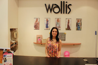
This is Zoe who works in Wallis. As I am not a Wallis shopper I used my friend to go in shopping and followed her and politely asked this young lady if I could photograph her. I wanted her behind the counter as this is her working environment.


Image Five

f.5.6 1/50
This is my Portrait of Paul who is a Butcher. As Paul was very busy I had to take the image very quickly whilst he kindly agreed to be photographed. Although I would have liked meat in the shot I had to take in to consideration it was a busy Saturday morning and Paul was very busy.


Image Six

f.5.6 1/6
This is my image of Ellisa a bar-maid in my local pub. The image is in her working environment of behind the bar. The lighting was terrible and needed a really low shutter speed.


Image Seven

f.5.6 f/25
This is Paul Natraj a Audio Tutor on The B-TEC & Post A-Level Courses at Blackburn College. I photographed Paul in the Radio Studio as it is part of the course that he teaches in and forms part of his working environment.


Image Eight

f.5.6 1/6
This is Matt a waiter at a Toby Carvery Restaurant. Matt is part management and is in charge of escorting people to tables from the reception area.

Monday, 17 May 2010

People Brief- The Human Condition

What is meant by 'the human condition'?
'The human condition' is a phrase typically used with respect the generality of situations that humans face in 'getting along with each other and the world', situations that are difficult to encompass in some way because of hang-ups or predispositions of one kind or another or just simple ignorance -"What did I do to wrong her?", "Why can't we get along with each other?" and "The beauty of a flower, isn't that proof of God"? -illnesses of a sort, mental and real, our own or society's, mental or real, and how they weigh upon us and society about us. The human condition is, for example, the material of poetry in general and the lyrics of most music ('rap' included) and various other 'secular' or even religious situations -lovers in warring religions, for example, and the irony in the contemporaneity of both most abject and most excessive 'lifestyle and quality of life' as in some parts of Africa and anywhere in the US. Perhaps the most obvious examples come right off any daily newspaper -the 'irresolvability' of the Israeli-Palestinian problem, letters to Dear Abby and Ann Landers (and their answers) -or the dog next door, run over and killed because your neighbor had a fight with his wife and forgot to close the gate. And there are more general examples too -the individual saddling his friends and relatives with his aches and pains or complaints on government: "They (whoever) ought'a do (whatever)" and "You can't change human nature". Various expressions of frustration, 'unrequited love', 'the seven deadly sins' -'the human condition' is some one aspect or another of these items.

2 - Why does it always seems to have a sorrowful or 'negative' cast to it? -examples otherwise?
'Discomfiture', in general -mental or physical, is antithetical to our evolutionary nature which is, more correctly (and genetically), 'the pursuit of best well-being and viability', so when we come up against anything that is 'troublesome' to that pursuit in some way, we tend to linger on its 'resolution' -or at least wonder "Why can't we -" and "If only -". When there is no such problem, on the other hand, we automatically get on with the routine of life.

Examples otherwise? -the typically superficial and essentially momentary 'happiness in another's good fortune' and 'glee at your team winning!', for example -not generally bagged as 'human condition', but schadenfreud in particular and extreme: 'happiness in another's misfortune', which, by its very substance, reflects completely consistent 'negativity'.

Tuesday, 11 May 2010

Places Brief- Final 8 Images

I have chosen my final 8 images for the places brief. Lots of thought has gone in to trying to capture images that fit both the categories of the brief and also relate to me in some way.

Significant Places Images

For the significant places images I have decided to show my old workplace 'The Old School House' which was a pub where I worked for over a period of 5 years. I also spent most of my wage putting it back over the bar and spent a lot of my time there and to show the pub as it is now upsets me in a way because I remember all the good times that I had there and recently the pub has been trashed.

Significant Place Image
Settings: f 5.6 1/200


The second Significant place I have chosen is of a car park in front of my house. I used to play football here as a young child with all my friends. We used to put jumpers down against the wall as goalposts and play football against the wall. Cars used to get hit and bumped and many times we were told to stop playing, but being young and rebellious we carried on playing all the time. Nobody plays anymore and a lot of my friends have moved away and there was only my generation that has played in the last 10 years. When I see this car park and house I see me as a child belting a ball around, but in reality I now just see a car park.

Significant Place
f.5.6 1/1,250


Wilderness Images

My Wilderness images have some meaning behind them and I have tried to show the meaning in my work. The first image is a rope on a tree branch in the woods. The rope used to be a rope swing which I used to attempt to make myself when I was younger, usually over a river and I was a bit of a thrill seeker when I was younger.

Settings: 1/60 f.10


The second Wilderness Image that I have chosen is a Lodge that is near my house. I love water and find the sound of a running river quite refreshing and relaxing. Sitting by the lodge is so peaceful and seems miles away from society.

Settings: f.5.6 1/800


Urban Images

For my two Urban images I have photographed Old Trafford Football Stadium from close-up and from afar. Old Trafford fits perfectly in to the Urban category as the stadium itself is in a Urban location. All around the ground shopping complexes and office blocks are being built and it is also built around a very industrial area. I have tried to show this in my work.

Settings: f.5.6 1/200

Settings: f.5.6 1/200


Alien Environment

My Alien Environment images were taken in Manchester City Centre. I am 'Alien' to Manchester and only really visit several times a year. I took Manchester Cathedral and a backstreet of Manchester. I am not really a religious person so Cathedrals are indeed 'alien' to me.
Settings: f.4.0 1/640


Backstreets in Manchester don't really mean a lot to me but being from a little village within a Town backstreets are different in my eyes. My backstreet view is of houses back to back with a single street with just enough room for a car. In Manchester a bustling City the backstreet is usually a small alleyway with a company dustbin outside. So this image is definitely 'alien' to me.

Settings: f.5.6 1/40


Tuesday, 27 April 2010

People Brief- Fine Art Set Three

Fine Art Set Three

This is my third and final set up. I wanted to try to achieve a blue background in this setting. I struggled and found it tough to achieve but I think that I achieved it in the end.

This was a shot to establish the set and was very much a test shot. Yet again I used a Snoot light, and a Spill Kill on the other side. To achieve the blue I had a blue gel in front of a light on the floor facing the curve wall. It was triggered to flash when I shot the image. This shot was taken using 1/250 and f 5.6


Again this is a test shot to experiment. The blue background in this shot is what I wanted to achieve, however the face is badly lit and is very dark. The settings used were 1/60 and f 5.6


This again is a test shot and the background is a lot lighter, the face is lit better though. This was taken using 1/100 and f 5.6


This image went completely wrong, the image is too dark and there isn't even a hint of blue anywhere. The settings were 1/200 and f 5.6 and these settings are clearly incorrect.


The settings in this shot were 1/250 and f 5.6. I decided to shoot really close up to the model but this image doesn't work. The background color isn't too bad but my model looks like a character from Avatar.


Yet again this was shot using 1/250 and f 5.6. I shot this close up and the lighting on the face is lit quite good. The background light is lit a blue/green color too which I am happy about.

People Brief-Fine Art Set Two

Fine Art Set Two

These images are taken from my second shoot with my model Becky.

This time I shot using two lights. I used a snoot on one side and on the other side I used a Spill Kill. I used these two lights as I wanted to try to achieve a spotlight effect.
The first shot was taken using settings 1/100 and f 5.6.


This was shot using settings 1/250 and f 5.6. As you can see it is the incorrect setting to use as you cannot see much, so I decided to use 1/100 using f 5.6


Again this image was shot using 1/250 and f 5.6 and it is the incorrect settings to use as you cannot see my model clearly at all.


This image was taken using the settings 1/100 and f 5.6. Because of the positioning of my model the right side of her face is too shadowed. This is due to the flash coming from her left hand side giving more light to the left side of the face.


Again the settings used were 1/100 and f 5.6. I like the light on the model better in this image. The background lighting is nice too and both lighting set-ups have a good blend together.


Yet again my positioning of my model has caused the image to be too dark. The setting of 1/100 and f 5.6 are correct but the positioning of the model away from the light means that the face is not lit enough. This is probably due to my model having her back turned away from the camera.


This image was again shot using the settings 1/100 and f 5.6. I think the image is Ok, the background is lit well and the face is lit quite well. The shadow caused by the hair in front of the face looks good but could have been avoided.

Overall in this shoot I think that the setting 1/100 and f 5.6 worked the best. 1/250 using f 5.6 was too dark and didn't work at all

People Brief- Fine Art Set One (Model- Becky)

On Wednesday 22nd April 2010 I had a Photo Shoot with my model Becky for the use of Fine Art portraits. I did three separate shoots using different lighting setups and Becky had brought a selection of outfits to change in to. With every shot came different camera angles and different settings. In one shoot I had a light placed facing the curve wall with a blue gel in front of the light. When I took the image my idea was to have a blue background to give the images a bit of variety and their own identity. At first I struggled with the settings and kept having to change the strength of the lights to try to gain the blue effect I was after. Eventually after snapping away and altering my settings on every shot and moving the position of the light every so often I finally found the effect that I was after.
However after looking at my selection of shots I realize that these images do not fall in to the category of 'Fine Art' as there is no significant style in the work, it is just a model in a studio rather than a creative style that I as a photographer has an interest in.

Fine Art Set One


Studio Set Up 1/250 f 5.6

For the First shot I had the studio set up with a Beauty Dish and a Umbrella. Although my model is stood behind the Umbrella she didn't stand here for the shoot.


This was a test shot to establish the best settings to use. This was shot at 1/250 and f 5.6. I like the background color in this shot and I think the slight grey blend at the bottom gives the image character.


This image was taken at 1/200 and at f 5.6.
I think the background is too light and the face is too bright using this setting


This image was taken using settings 1/250 and f 5.6
This image didn't work out how I planned, the light is too dark. This is due to me moving my model in the wrong position away from the light.


This was shot using settings 1/250 and f 5.6
I like the color tone on both background and skin tone in this image, the face is lit well as is the background.


This was shot using settings 1/250 and f 5.6
This was a shot to test the lighting and to see how it looked. I like the lighting of the face and the background,

During this particular shoot I found that the best camera setting for my lighting set up was 1/250 shutter speed with the f stop on 5.6. I feel that this gives the best color on both model and background

People Brief- Overcoming Problems

One of the most challenging things in this brief has to be getting hold of people to photograph. I have been let down countless times by people who I had arranged to do a shoot with. I did manage to re-schedule some shoots for a later date but in general being let down by people has been a problem. However I did have many ideas generated and there are lots of different people who I can photograph. So far I am planning to Photograph a Hairdresser, a Sky Retail worker, a Bolton Council worker and a Joiner. However these ideas may change due to peoples availability and also a limited time scale that may occur. I have also been trying to create a photograph for the use of fine art portraiture. I have also Photographed a girl who work's for 'Pets at Home' again this changed and I had to kindly ask this girl after being let down

I am experimenting with every category of Fine Art, Candid, Corporate and Environmental Portraiture. I feel more comfortable though with Environmental Portraiture and will focus on this subject as my final eight photographs.

I have found Candid Photography quite challenging as it is difficult to Photograph somebody without them looking at the camera. I also feel as if I am spying on people and invading their privacy, but it is a problem I will overcome and will achieve the images I set out to take.

I understand the importance of photographing environmental portraiture correctly and that the person in the photo is not the important part of the image but in fact the working environment that is indeed important.

Sunday, 25 April 2010

People Brief- Candid Photography Research

Candid Photography is when you take a image where the subject or subjects in the photograph are unaware that the photograph is being taken. It could be argued that tabloid newspapers and magazines use alot of candid images and that it is a form of Papparazi. I think this is a difficult form of photography as it feels like spying on somebodys privacy and if people look directly at you whilst taking a shot they might become angry towards me.
Below are some shots that are in the candid genre of photography.


In this image we can see a young lady who is unaware that she has been photographed reading a book. She looks lost in her own world and this photograph is a good example of candid photography.


This image by Henri Cartier Bresson is a candid photograph but very different from the first photograph. This time the gentlemen in the image have been shot from a different angle altogether. However althoughthe two images are different I think they show the diffefences that you can achieve through candid photography.


This is probably Henri Cartier Bressons most famous image 'Behind the Gare St. Lazare, Paris. Cartier Bresson talked about the decisive moment and taking a photograph in a instant. The man is caught in mid-air just going about his business. I feel that this image fits in to the candid photography genre.


This is an image of Sarah Harding from Girls Aloud. This is a typical photograph that you would expect to find in a newspaper and magazine column. I do feel however that it is a candid image as the people in the photograph are unaware tha they are being photographed.

Tuesday, 20 April 2010

People Brief- Fine Art

I have been looking at examples of fine art portraiture and studio lighting set up's to give me ideas before I shoot my own fine art images.


Below is the first examples that I found. I really like the idea of coloring the background and I am looking in to recreating something similar in the studio if possible. The color of the girls top blends in well with the background. I don't think I would need as many lights as in this shot but I will experiment as I go along trying out different ideas.


Below is my second example and the image is completely different and in a different style. Less lights have been used on the model and the use of a white background and white dress works well. The skin tone on the model gives the image more character and also the red handbag makes the image complete.


The third example below is very simple but the photograph works well. Yet again the color of the dress blends in with the color of the wall but I don't think it looks out of place. The lighting on the model and her skin tone give the image character and I think it works well.


The fourth image is completely different from the other images. First of all the black dress and red ribbon stand out in the dark creme color background and the models hair is also a feature in the background . Although the model is looking away I think the image works well.